CLIENT: The Smithsonian
PROBLEM: Needing a companion app that would not only navigate the user through the museum but engage them with fun and educational fuctions.
MY ROLE: User Testing, Competitive Analysis, Persona Research, Sketching
DISCOVERY & RESEARCH
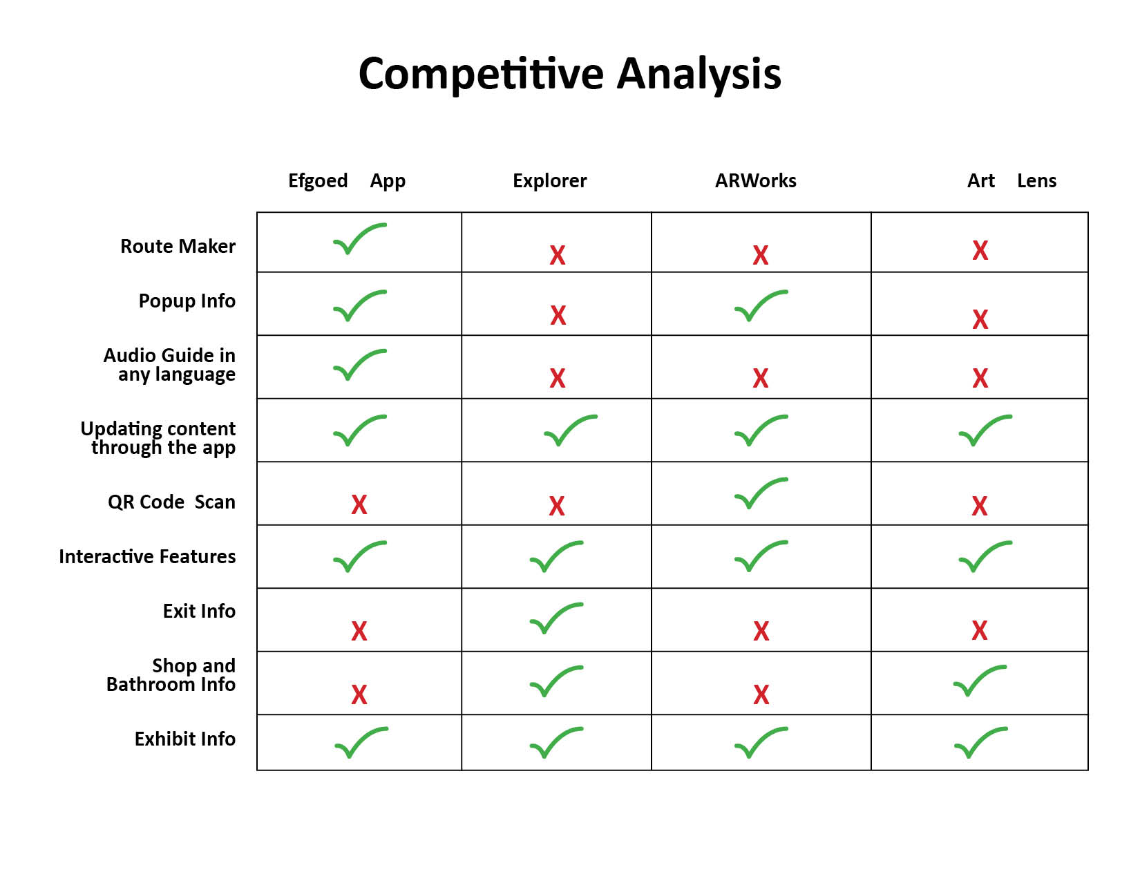
The competitive analysis for our Smithsonian app delt with looking at a handful of popular apps used all over the world in the museum setting. They all had a variety of unusual and unique features to help interact with the museum. But most of them were too clunky and didn’t marry the right features together. We pushed forward with an app that gathered the best of these features as well as adding a few more! Below you can see the feature comparison.
Design Inspiration Analysis
While looking for inspiration we decided to visit the museum itself. After spending an afternoon walking through the museum we were ablet to draw on the rustic historic feel of the museum. We wanted it to be fun and modern as well though. The app is hoping to draw in a younger crowd so we knew we wanted to use to the clean modern look of most apps today as well as using compelling large photos.
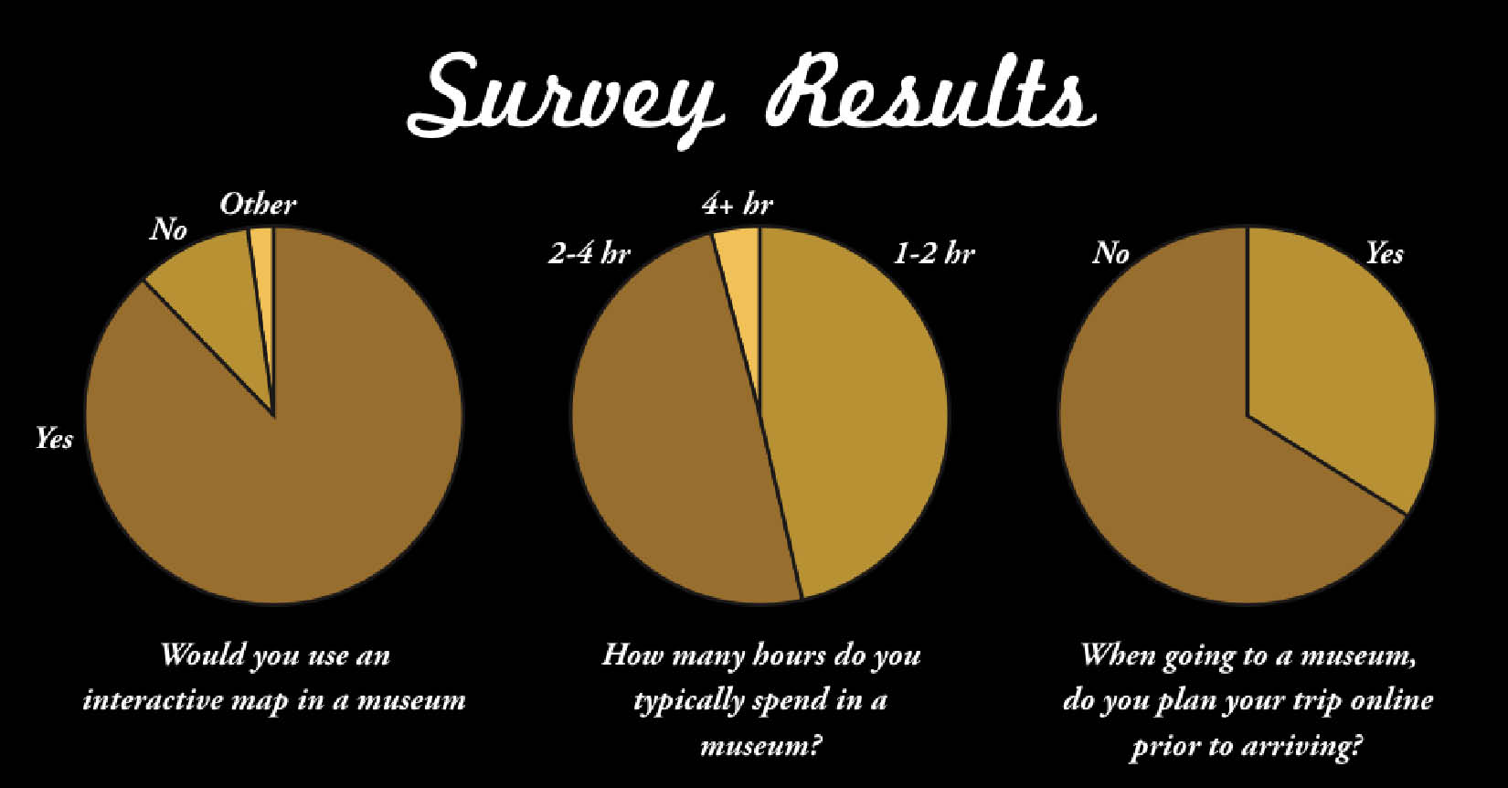
User Interviews
We conducted user interviews in the museum and in the office. What we were able to glean from talking to museum-goers was that their biggest pain point was navigating the large museum. Even though they were provided with paper maps, they weren’t very helpful and they were hard to juggle with all the others things tourists were carrying around. Bathroom, shop, and exit information was also extremely important to the users and they said they were always having to stop and ask someone where to find these!
SKETCHING & IDEATION
User Stories and Journeys
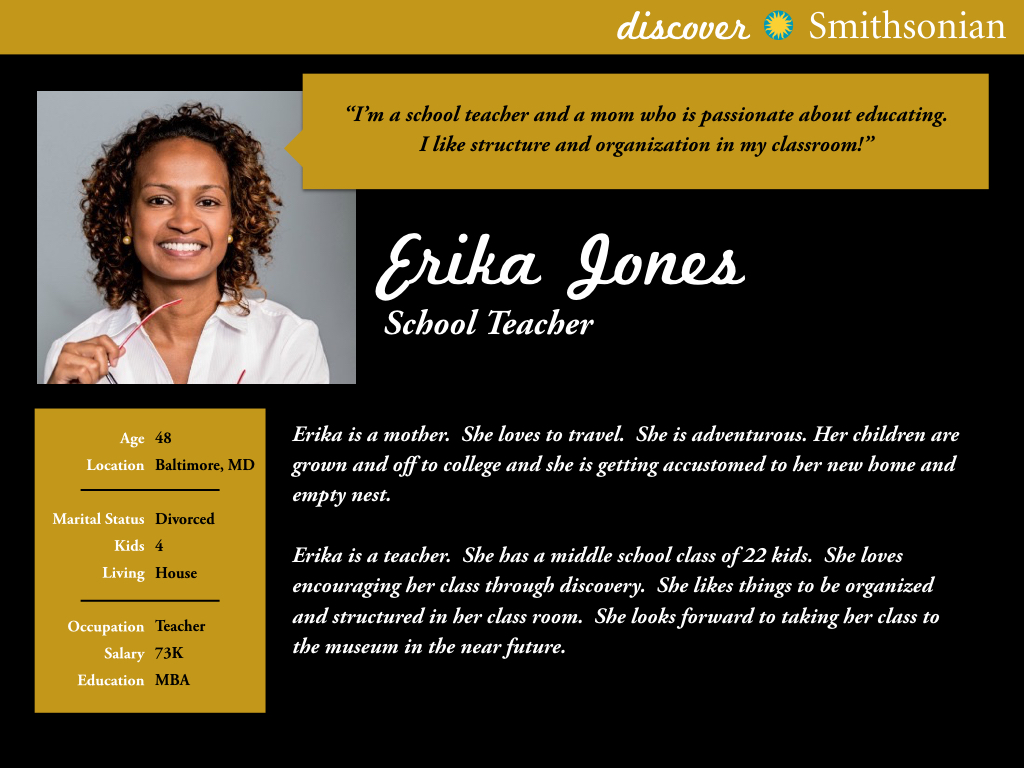
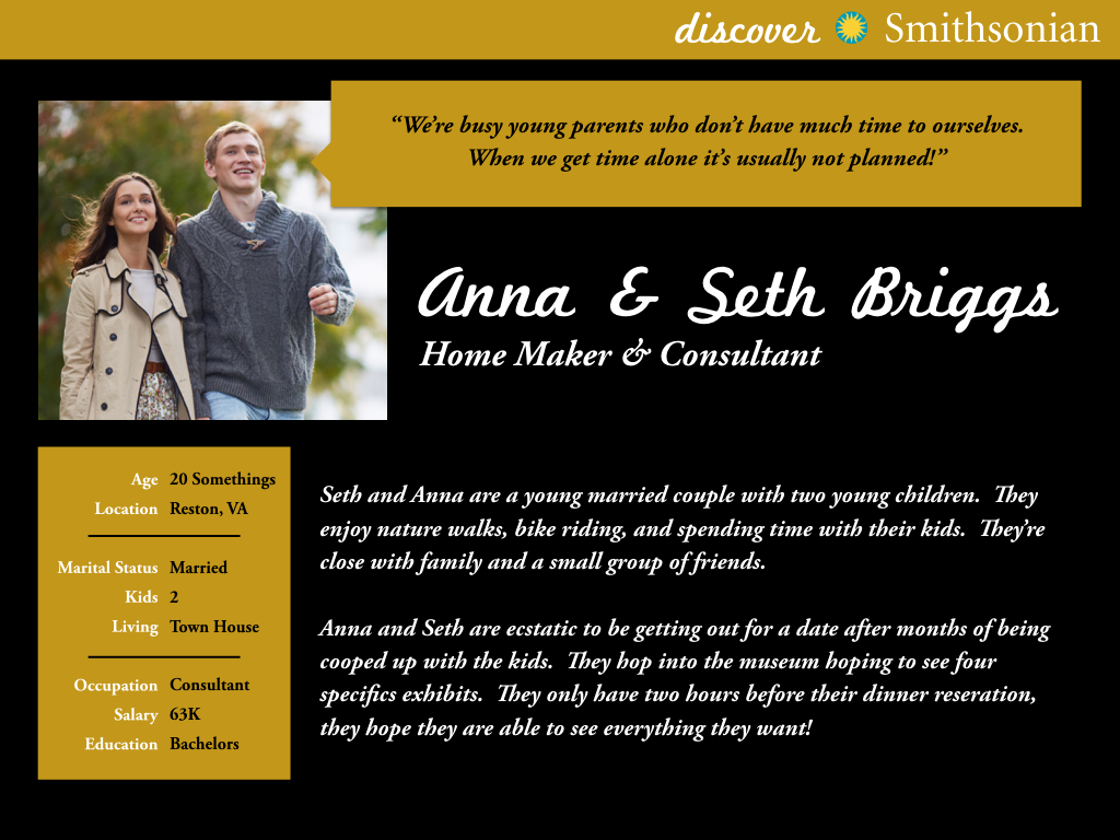
After researching our user we were able to boil our personas down to two basic users: Erika Jones and Seth & Anna Briggs. Erika is an organized and structured middle aged women who has to keep her 5th grade class engaged and on a route during their field trip to the museum. Seth and Anna are a young married couple who have an unplanned trip the museum and they need to stay on track while they wait for their dinner reservation.
Rough Sketches
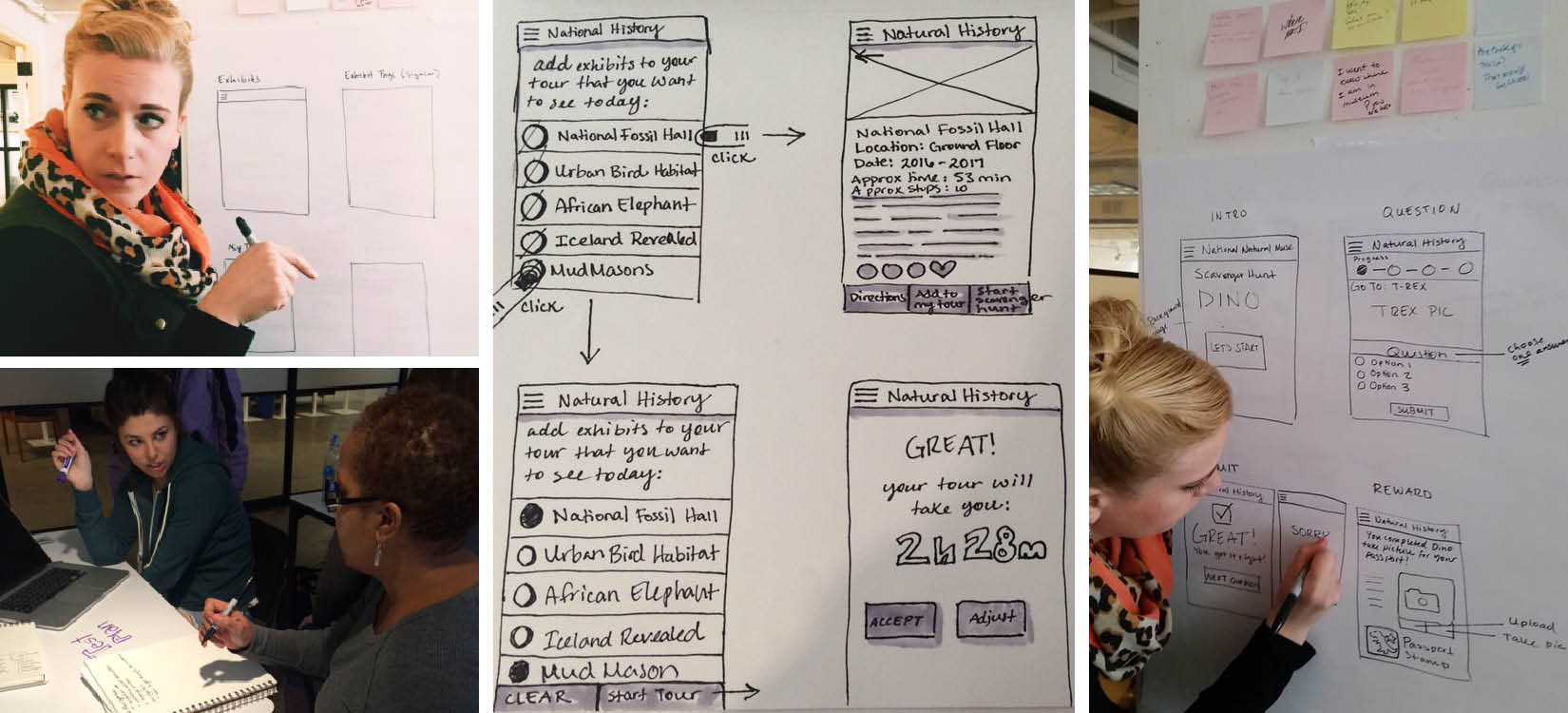
For our sketches we started thinking about how the user would scroll through the exhibits and take a fun little scavenger hunt. Below are snapshots of the team brainstorming our concepts for the scanvener hunt, trying to decide how they would see their questions and progression through the app.
NARROWING SCOPE & STRUCTURE
User Flows
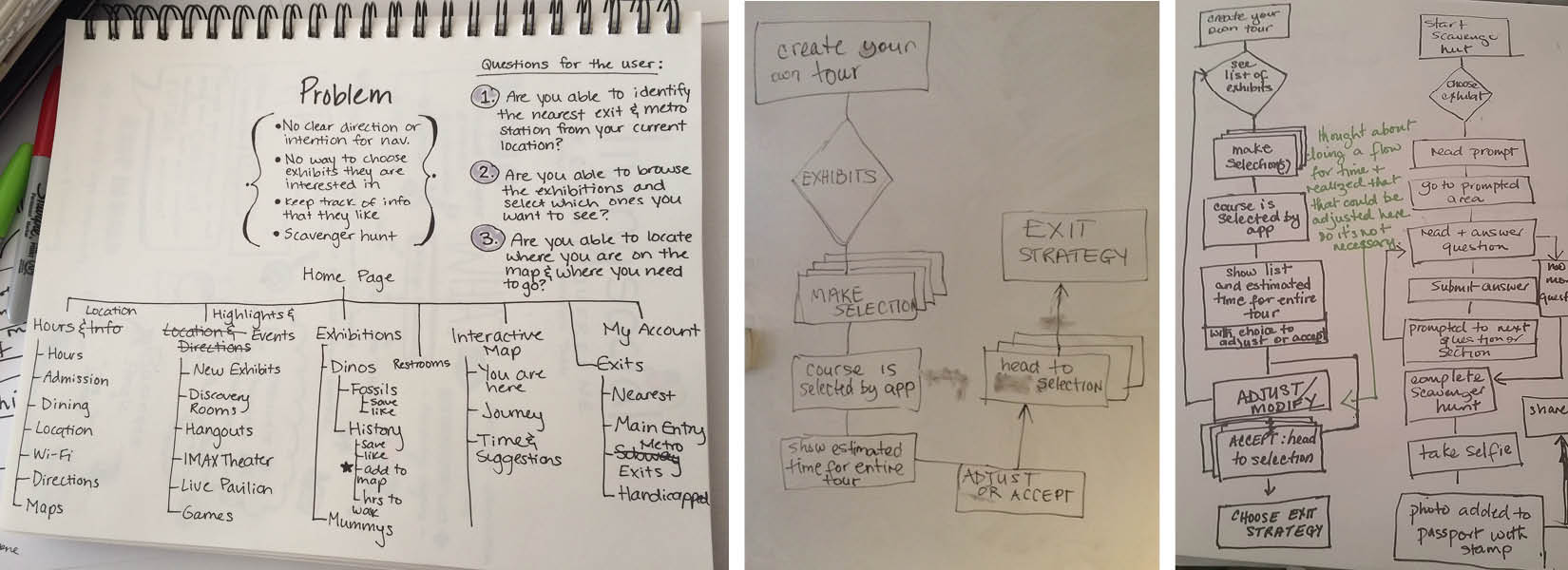
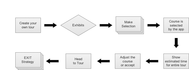
For our user flows we decided to focus on the user’s experience making a scavenger hunt and creating their own tour. These two were the most important flows for us to focus on since they covered our topics of “navigation” and “engagement.” Through the creation of a scavenger hunt the user would be given clues to take them through each exhibit with fun facts and tasks. Through the creation of a tour the user would be able to choose the exhibits that they liked best and would given a handy map on their phone to take them through the museum.
Sitemaps & Diagrams
We brainstormed a site map so we could better decide which parts of the app to really focus on for our presentation. We wanted to pay attention to user’s desire for bathroom, shop, and exit information. So even if we didn’t flesh those part out right away they would be accounted for under our site map.
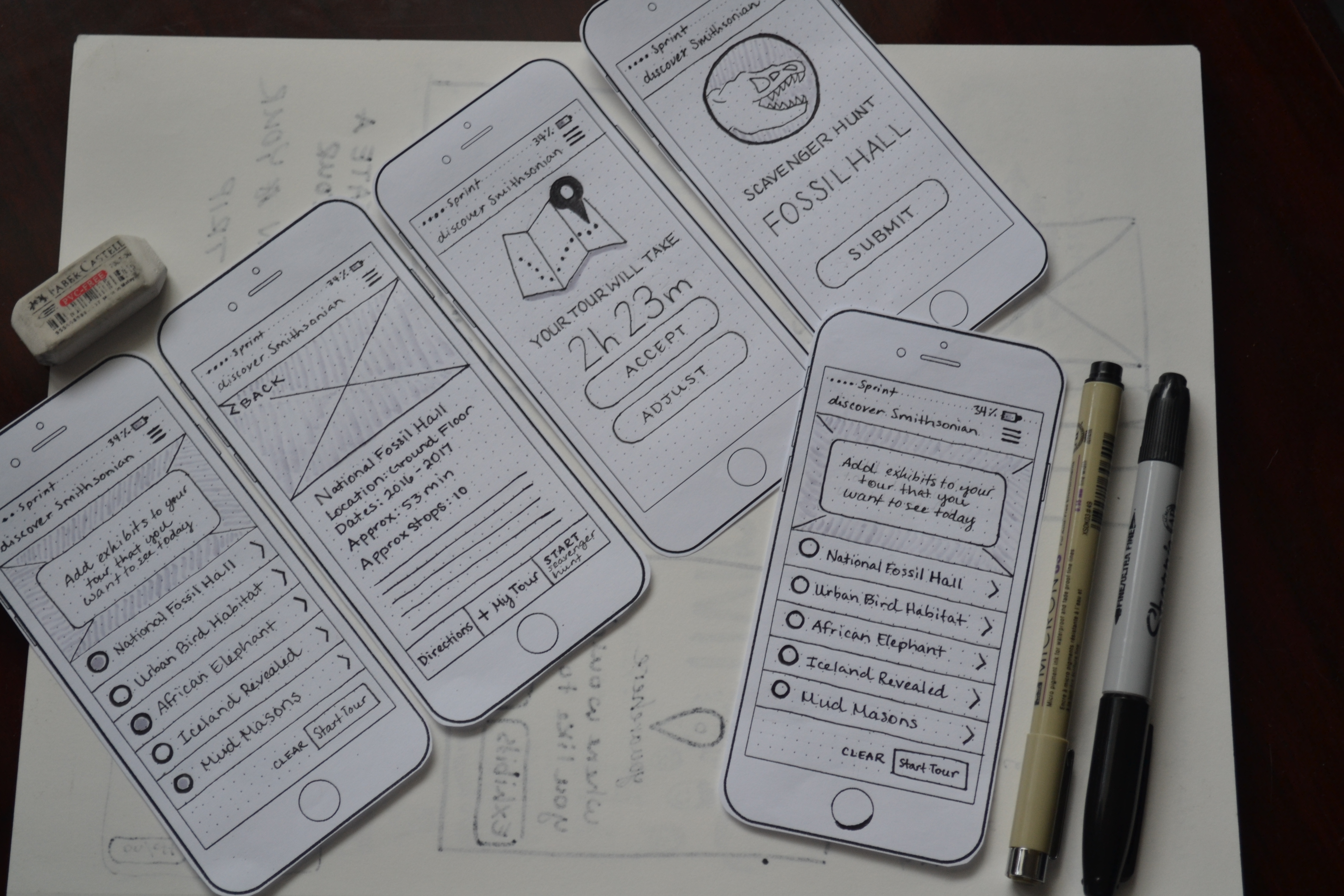
PROTOTYPING AND TESTING
Prototype
After going through several iterations of the app as a team we decided on our final design. I was responsible for making a hi-fi sketch paper prototype. My teammate Samantha then used our paper prototype to make the initial digital design in Axure. Below is a snapshot of my paper sketches.